Requirements and Research
Existing customers of a very large Self Checkout provider requested an updated system to manage interactions with shoppers who needed help during a self checkout shopping experience.
This app would run on a small tablet that would be mounted to existing hardware in a retail environment.
From a business perspective, this new software was a necessity as some customers made the refresh a requirement before purchasing more solutions from us. We hoped the refresh would not only increase delight and job satisfaction for the end users but increase our chances for customer retention.
Spoiler alert: I'm happy to say our new design made existing customers very happy!
During our initial discovery interviews with customers and account executives knowledgeable with the existing (nearly 20 year old) product we found out that there was a large opportunity for improvement in usability and accessibility.
We can only go up from here folks!
Flows
One of the first discovery activities we did was work with the stakeholders to define all the flows needed for an MVP. We held a series of workshops remotely using FigJam as many of the members of the team were international.
To prepare for these workshops, I worked with the lead designer to examine the flows in the existing product and outlined those in Figma along with screenshots. This way I could more easily compare my wireframes to make sure I wasn't missing anything that was essential to the existing app experience.
We then validated those flows with the customers. They gave us some great feedback, raising our feature awareness and I went back to Figma a few more times to add on to the FigJam to make the necessary adjustments.
Flows
Ideation
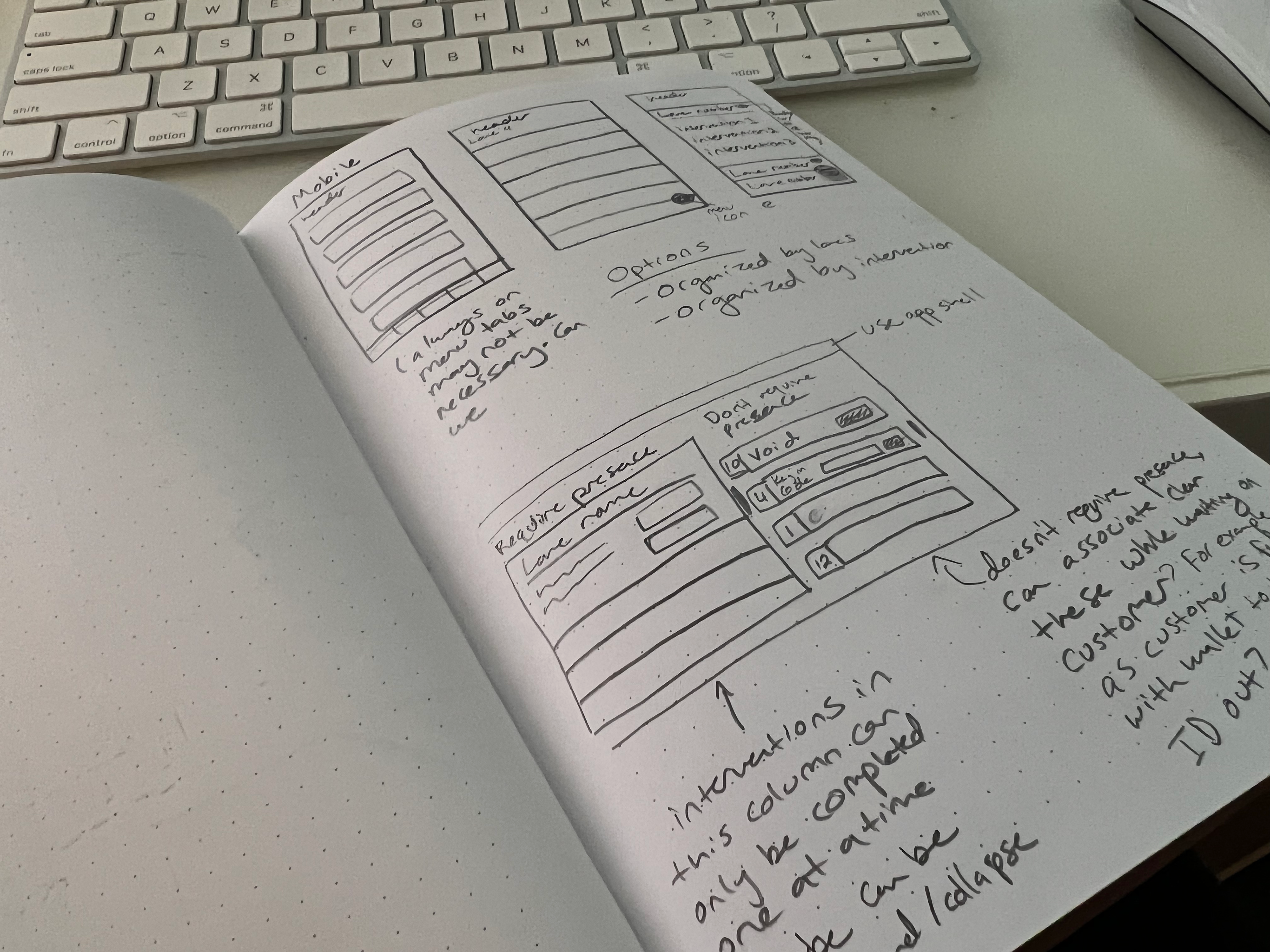
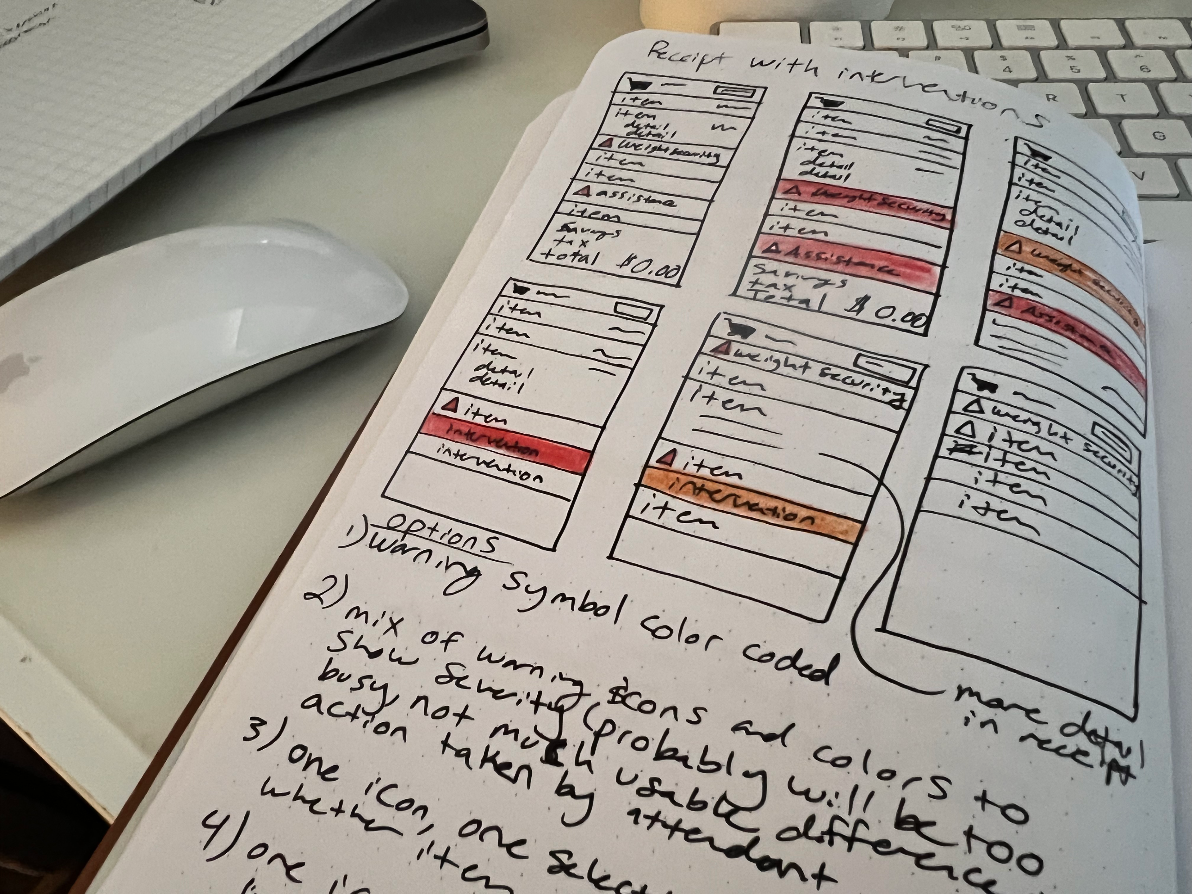
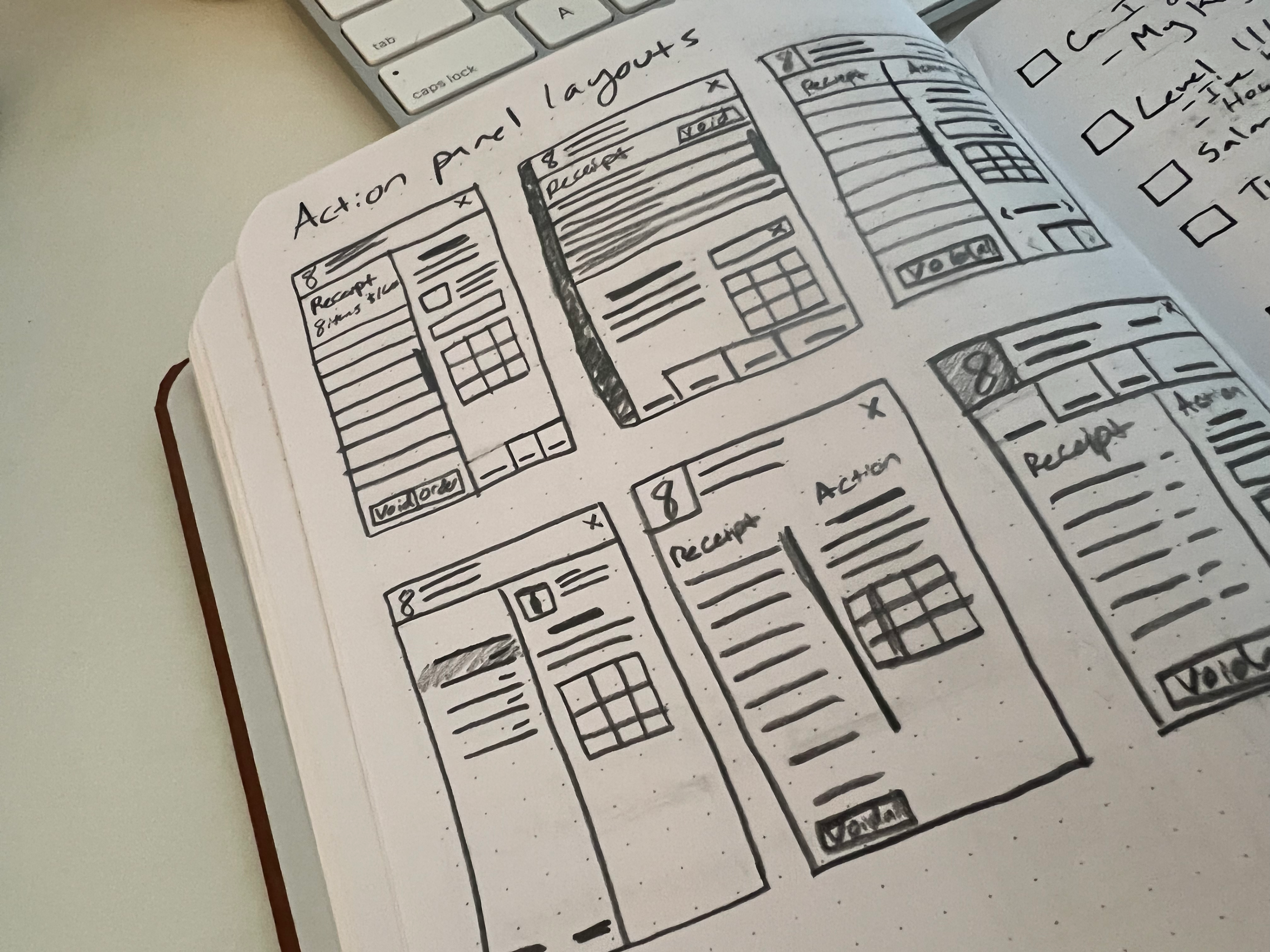
After finalizing the flows with feedback from customers and key stakeholders from the business and development teams we set about working on the wireframes, I had a lead designer on this project leading most of the meetings, but my primary task was producing most of the design and prototype work.
Design Process
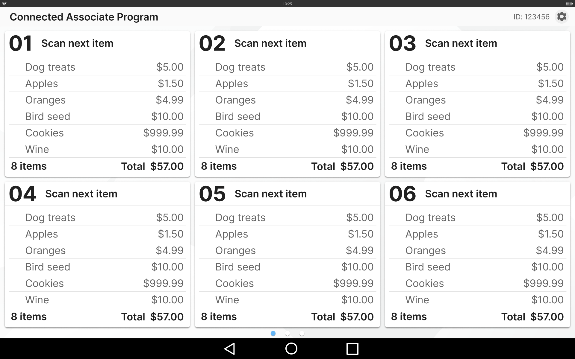
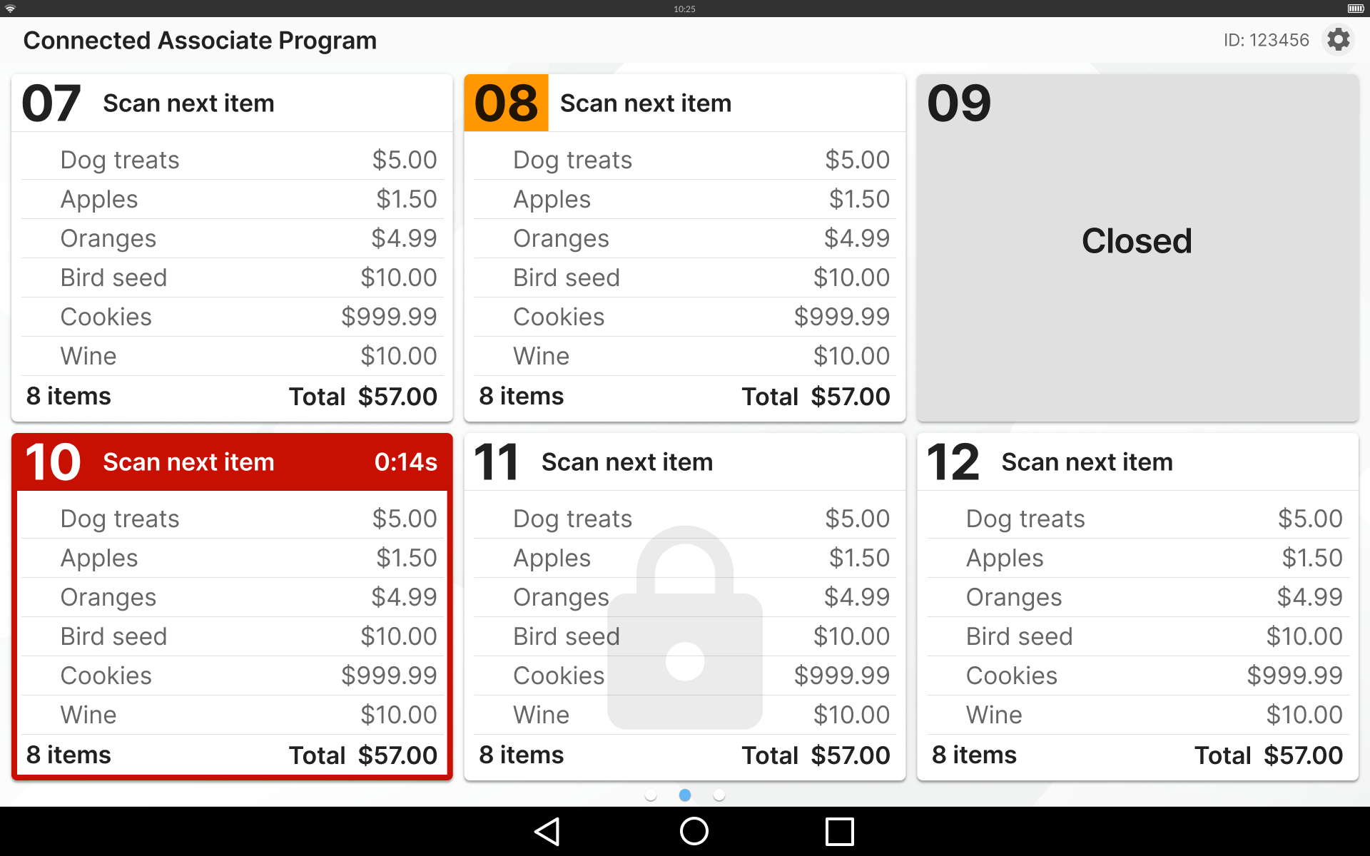
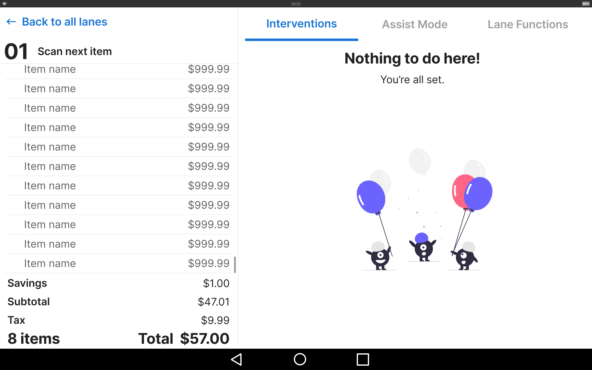
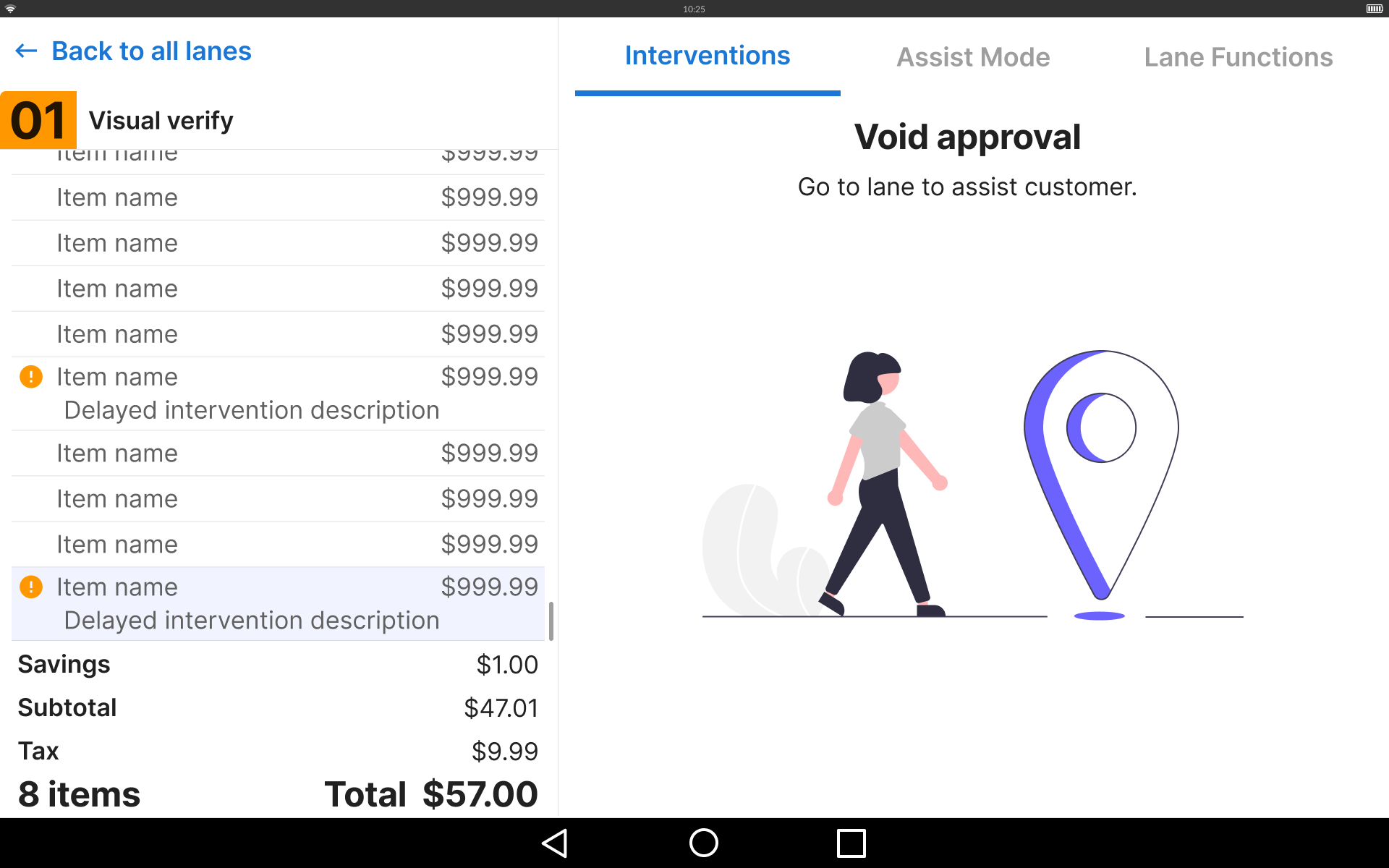
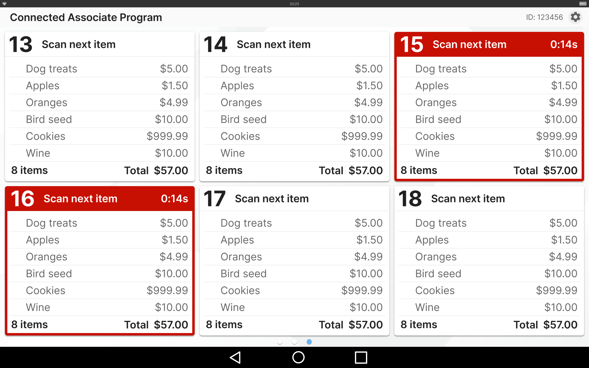
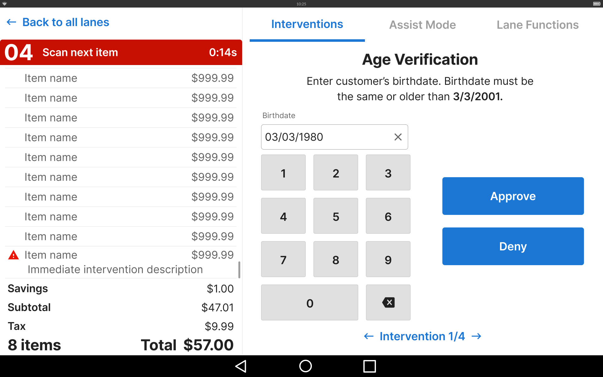
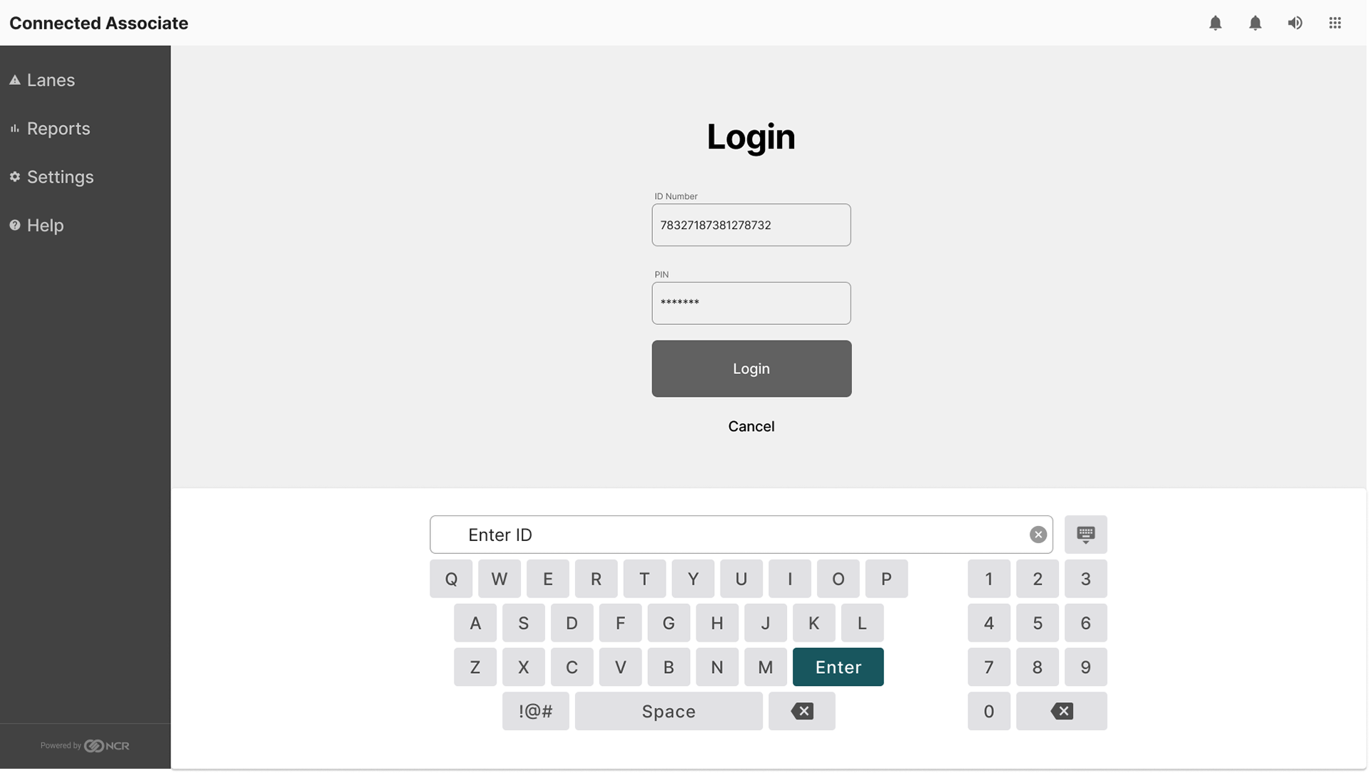
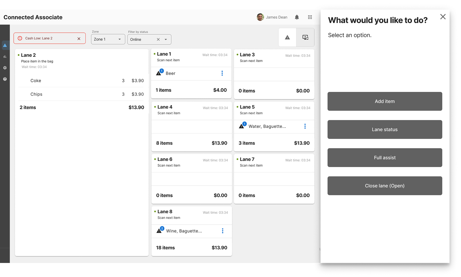
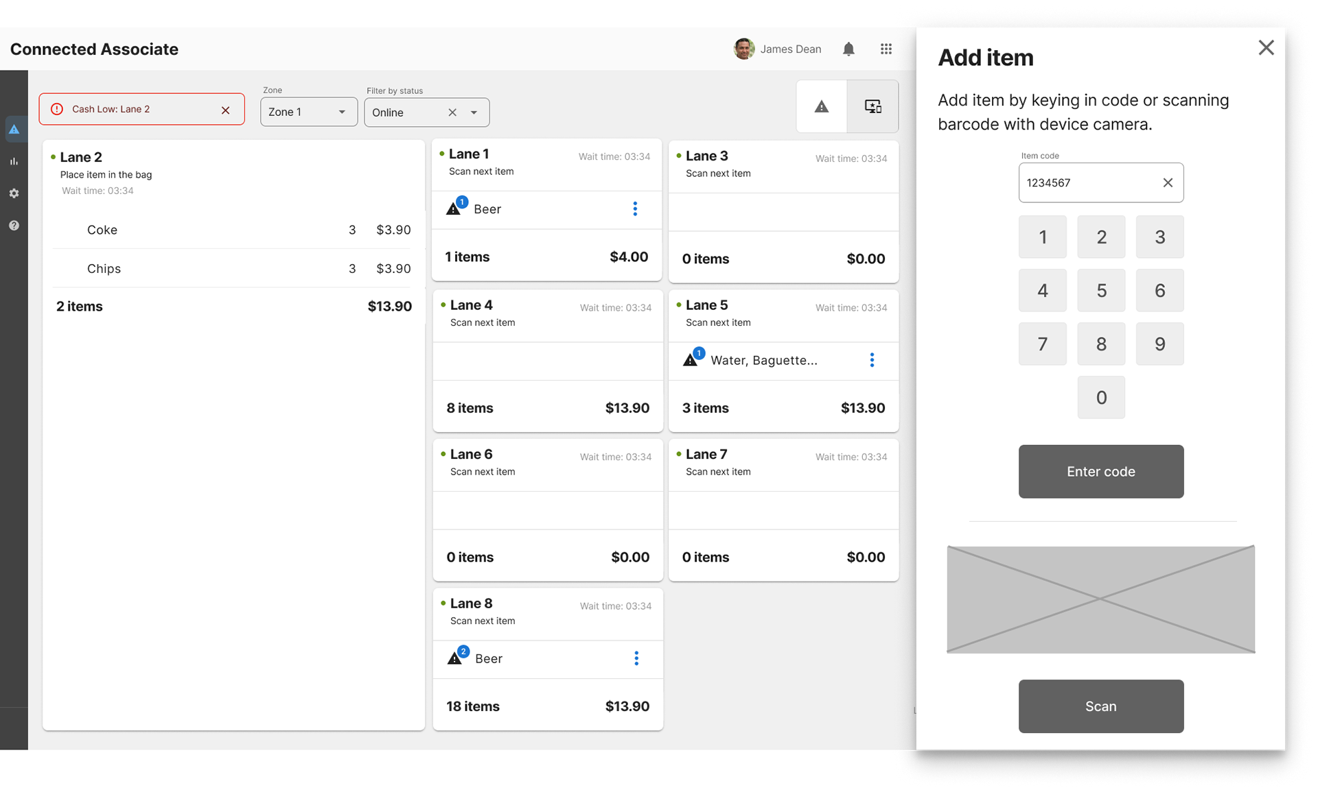
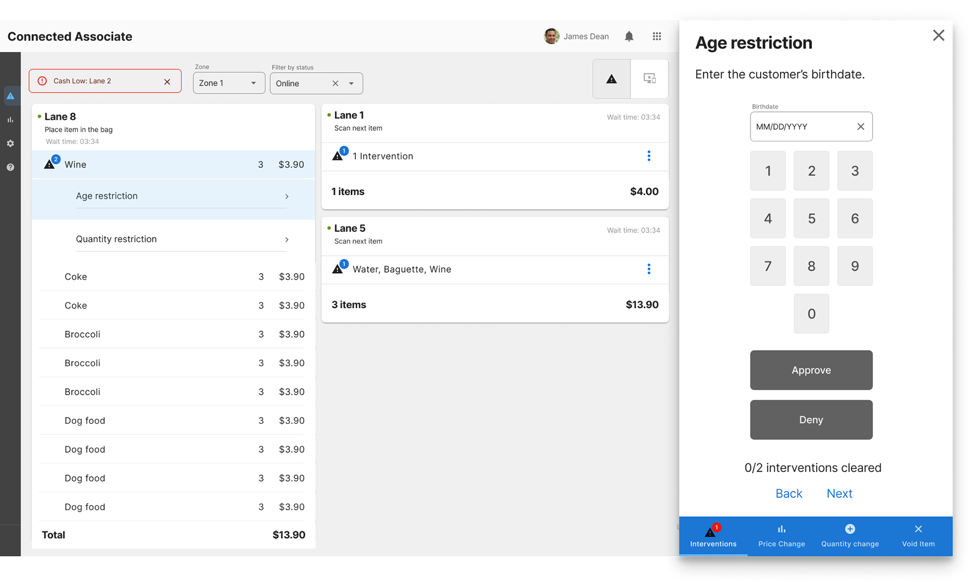
I used the company's design system as a base to get started on the high fidelity screens. I did face a little bit of a challenge since the existing library was currently only designed for web and mobile. No tablet design system had been built yet.
So I took the same design language and updated touch area sizes and font sizes to work in the environment our product would be in: a fast paced retail environment where a 10 inch tablet was permanently mounted to the back of existing hardware.
Information on the screen would need to be dense enough to show the end users what they needed to see, while the touch areas were large enough to comfortably reach from 2-3 feet away while the retail attendant was on the move in between self checkouts.
User Testing and Iteration
We worked exclusively in Figma to produce the designs. At the start of the project, product managers told us the hardware it would appear on was 5 inches larger than it ended up being as the project matured. Initially we had designed an interface with a drawer system that would hold all the controls that would affect the order cards that would take up 2/3 of the screen real estate.
Our first wires tested fairly successfully, but we learned that the screen size would shrink dramatically, so we had to adjust our initial design to accommodate for the smaller size.
This meant changing the UI where every function was essentially in front of the customers at all times to a compartmentalizing the functions across a couple screens.
Users actually seemed more satisfied with this approach as it simplified the information they needed to digest and increased speed of completing tasks.
The final designs ended up receiving a 5 out of 5 rating for ease of use for most of the tasks we tested! Not bad for a few months of accelerated work!
Deliverables
The Figma prototype and style guide was delivered to development. Throughout the production process I walked them through the prototype and provided assets that they needed. Any logic questions they had I made sure to note explanations in a separate storyboards file.
